

|
|
|
|

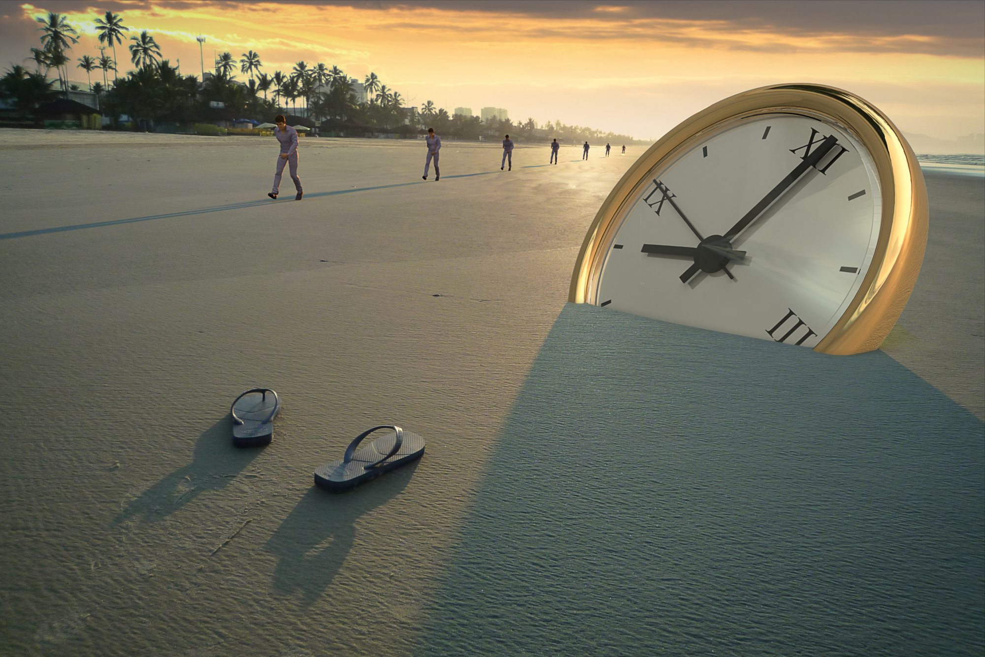
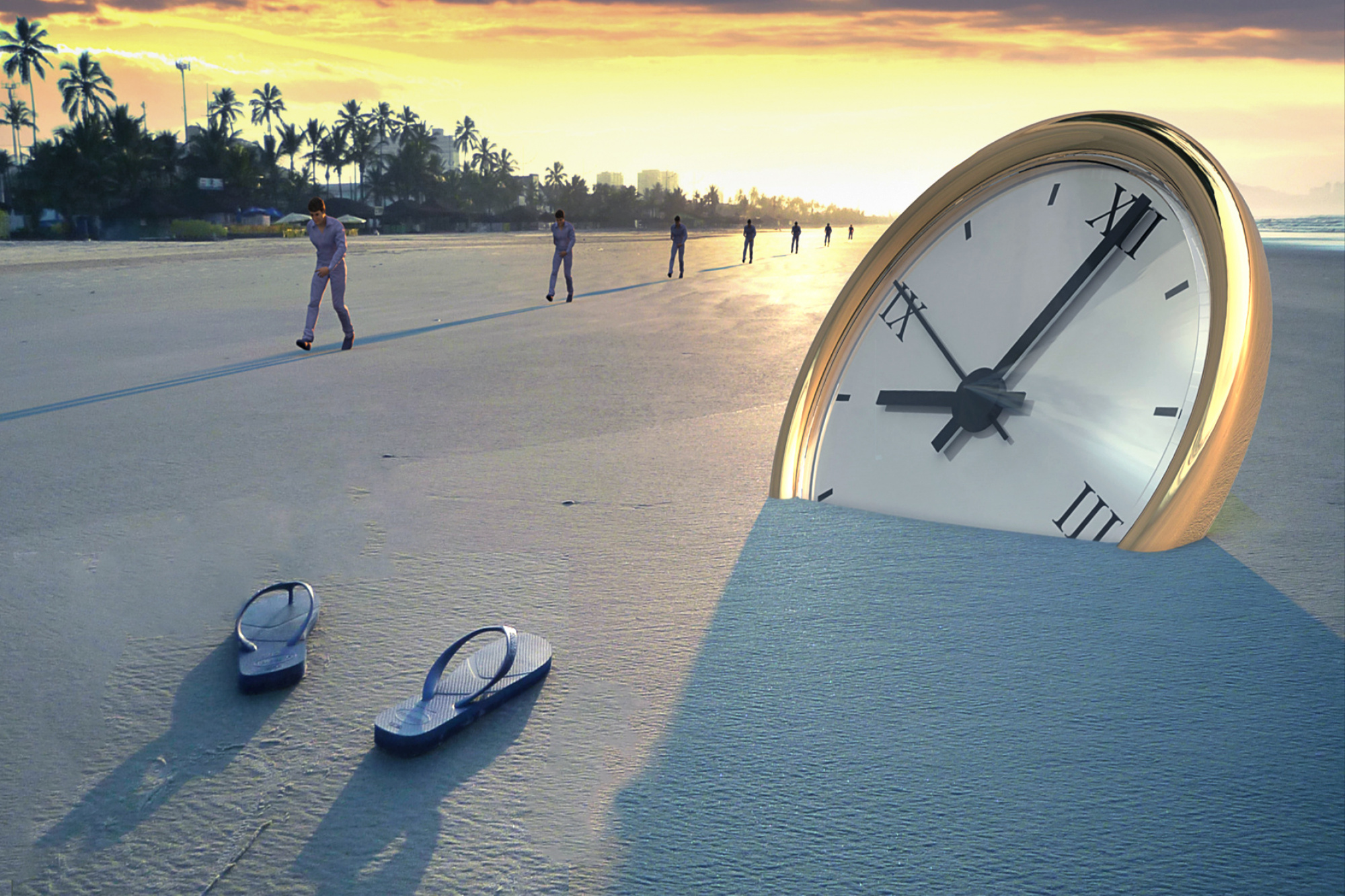
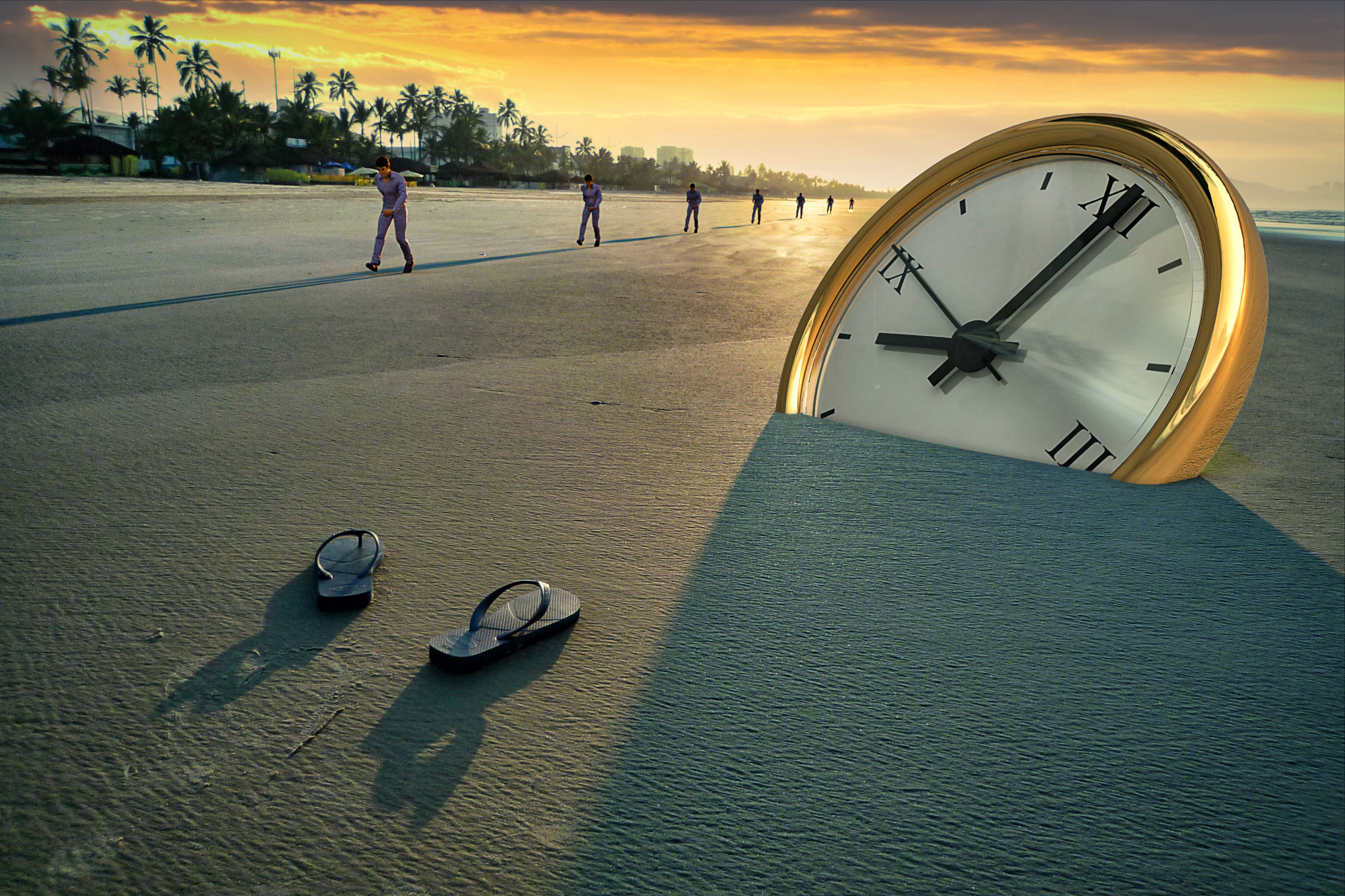
This is a conceptual work made to show how time master our life and how big is the strain in figthing it.
It is not the first one I made; published here there is also this: Fighting against the Time.
There are elements here that can add some 'nuances' to the main theme, and I will be not surprise if everyone will read something different.
The work is made overlapping to a background real camera image a rendered image of 3D models (men and clock).
The main remark I got is that the image can be improved on the technical quality side (this from curation process, about 50%).
I can agree with this, but I have to clarify few points, from some critiques I aleady got.
The background picture was taken about 9 years ago with a cheap 10Mpx compact camera and the image quality is related to this, quality that I accepted since I thought secondary here (maybe I'm wrong and you can tell me). I modified only the sky and added few contrast and sharpening.
The frame is slightly tilted, but also this, on my opinion fit the theme, mood and story (maybe I'm wrong here, too).
Another remark I got is about the men shadows that it is not aligned with the actual shadows. That's true: my only apology is that I preferred in this way to have a continuos line buiulding a divergent vector. But I understand that this can break the illusion.
Many thanks in advance for taking your time in checking my image and giving your thoughts.
Walter

Walter,
For me this composition has not the right balance. For me you need the following improvements: Foreground too long, clock to close to above and the rightt, more white in snow, and the skyline not straight. I tried to repair a little bit, not perfect but for me a little bit better. I brought the bath slippers a little bit closer for making a crop, Below a little bit better composition. Theo-senior critic.
Hi Walter may I say thank you for given us a try - I will jump right in as they say. - May I point this this is only my view and may not fit into your work flow.
Your image - My first impression it looks a little lack luster. This is an image of power and impact in my view should jump out and shout at the viewer.
I love the idea behind this fine image - So this is what I did - Back into Photoshop to see first hand what I could have a play with. Composition wise I quite like. Clarity up a little - Saturation and Dehaze to add colour and contrast in one go. - A little dodge work around the clock and sand. - Last I used Nik tools Tonal Contrast on all but the sky. - To get that texture and power to please the viewer - Thank you for sharing...

Walter,
Thank you for sharing the photo here in our Critique section. I have the feeling I've commented on it before - perhaps in 'member curation' where we vote on pictures and are sometimes asked to comment.
I like conceptual images. The best can be a blend of 'documentary' and 'abstract', so there is a story, a feeling, and a deeper meaning as well. When we see an image that we know has been deliberately created we have to ask what it means. That requires an investment from the viewer.
Here there's a line of people, a huge clock half-buried in the sand, and an empty pair of shoes. The people are all the same and all in one straight line. That suggests boredom, everyday life, tedium, putting in one's time, work . . . that sort of thing. The clock represents time. Inevitable, unstoppable. ♫ Time, she's a fast old train / She's here, then she's gone / And she won't come again ♫ . . . . Townes van Zandt. It's interesting that it's golden and huge - as if it's from another dimension. It's showing the time as about one minute past eight o'clock. I don't know if that's significant, or if it was just to make the hand point out of the frame towards the sea. It's often said that we tend to 'read' images left to right just as we do text, and the big hand on the clock adds to that motion. The shoes are pointed in that direction as well. But the important detail is that they're empty. Whoever was walking in those shoes is gone. So the 'story' I find is about life and death. Or escape. The line of people, all the same, all going in the same direction, looking determined and purposeful - but dull and indistinguishable one from another . . . . and one going, going, gone the other way into the unknown dimension.
Is that too much to read into the image?
On the subject of image quality. It's good to have adequate quality, but not as important as substance and meaning. In my opinion.
As for improving the image - a stronger tilt to the horizon, or even curving it with Photoshop's 'Edit>Transform>Warp' so that it suggests the curvature of the earth - so that viewers know you did it deliberately and won't mistake a slightly tilted horizon for an editing mistake. And I like Daniel's idea to strengthen the colours - especially the gold of the clock.
The title is fine - 'Timelapse'. I think a title for a conceptual photograph is very important. It should hint at a meaning - or several meanings - without spelling anything out to clearly. It's my opinion that viewers appreciate best the images that they feel they have 'discovered'.
. . . . Steven, senior critic
Many thanks Theo, Daniel and Steven for your insights and suggestions.
I'll try them in a slighlty different version of the image.
Regards
Walter
