
|
|
|
|
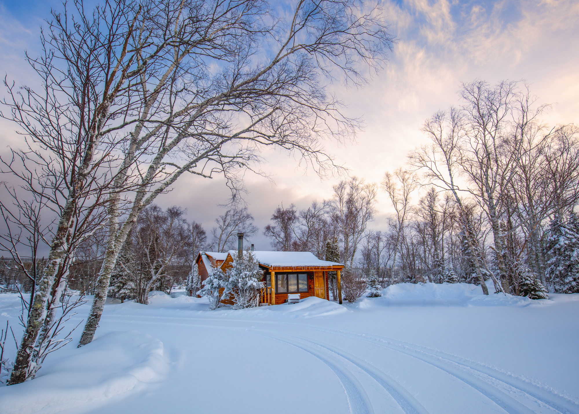
This photo was recently rejected and I would like to ask for help speculating on what could have been the cause and getting feedback on what could be done to make it better. I would like to resubmit after a while because I still like it a lot.

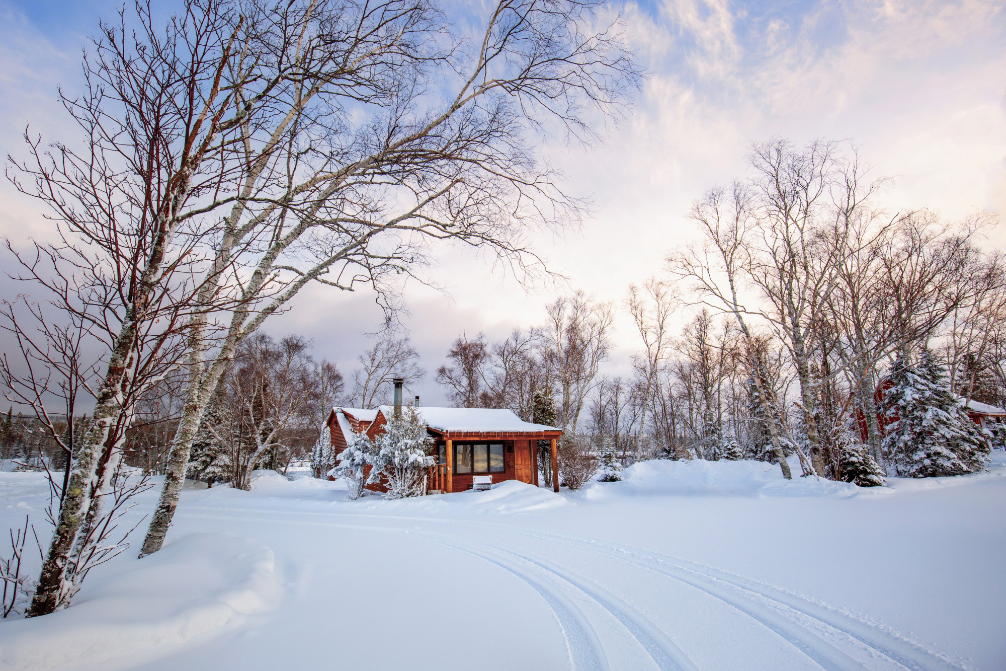
It was taken after a night of fresh snow had fallen in northern Minnesota. We stayed in another cabin near by. But this little red cabin was right where I wanted being framed by the arching trees on the left, woods on the right, and a fresh set of tire tracks my friend happened to create for me moments prior. There were still clouds in the sky but the morning sun from the right finally were spreading warm golden hues.
I took the picture in color with my Canon 5d Mark III. Nothing too special there. But I just noticed the settings were lost in the final posted photo, possibly due to PS stripping the info at export. The following screenshot shows the settings:


Hi Amy,
thank you for showing.
I am only new to 1x meself, but I will tell you what I feel about it.
The scene is great. It is this winterland we do not see here often. But I think the edit of the cabin is overexagerated. That would make me probably to reject your photo. The first posted version here in the post (the colourkey) I would not use. Colourkeys have way to often a strange look to them. And your sky has loads to add to the picture.
I just toned down the cabin in colourintensity and -luminosity.
For me that works better... but it is only my 5cts worth....

Amy,
Thank you for sharing 'Serenity' with us here in Critique. I prefer the colour version as the 'colour key' technique feels a bit gimmicky. That's my opinion only.
The theme of 'welcome home' is easy to read and comes through clearly. The cabin is clearly the subject, and well positioned in the frame with the trees framing the scene on left and right. Lots of space around the cottage makes it seem more appealing - small and cozy. The opposite colours help - if you're going to do more editing, I suggest keeping the cabin warm - but more of a 'woodsy' colour rather than orange - and keeping the snow and sky cool. The cabin will look more inviting when set in a cold looking evironment. I think it was Chekhov who taught writers that if you wanted to show how poor your character was, you place them in a lush, rich setting. It works in Photography - opposite colours and tones can make a subject look brighter and stronger.
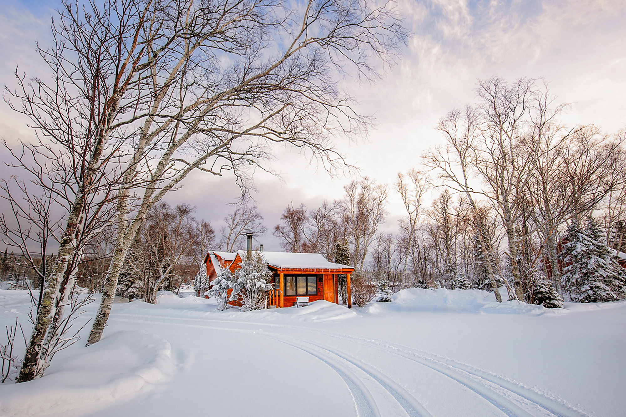
Jochen made a pretty good edit above. We had the same idea to tone down the bright orange colour.
For this edit, I selected the foreground snow, cooled its colour, and added some Texture and Clarity with those sliders in Photoshop's 'Filter>Camera Raw Filter>Basic'. It's one of Photoshop's most useful tools because you can make multiple changes all in one step.
I selected the cabin with the Quick Selection tool (shortcut = W) and changed its colour and saturation with 'Image>Adjustments>Hue/Saturation'. To make the cabin look more isolated I cropped away the neighbour's cabin on the right side. The tire tracks make good leading lines - although they're hardly needed when the subject is so brightly coloured.
One 'trick' that landscape photographers often use is to start the leading lines from the corners of the frame.
I bet this scene would be lovely at night with a light glowing from within and the stars and/or aurora dancing overhead.
. . . . Steven, senior critic
Hi Steven T ,
Thank you so much for the analysis, feedback, editing, and clear description of what tooling settings you used! I picked up selective colors last time. I have installed Camera Raw since. Looks like I will have a few more tricks to master from this discussion!
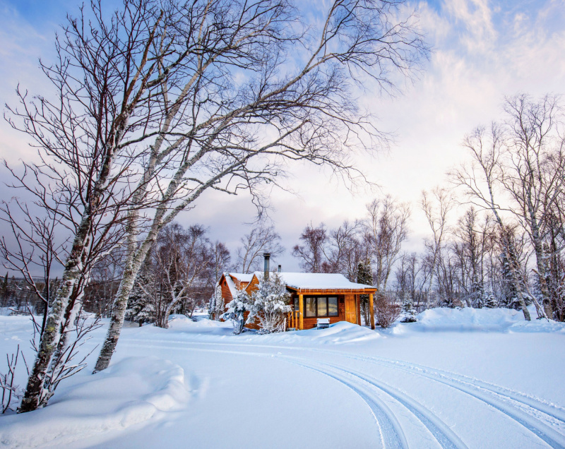
I agree with all the points! Keeping the blue surrounding, tone down the cabin color, good observation on the second cabin. Maybe I could carefully edit out the second cabin without losing the trees, and crop just enough from the right to have thtracks from the corner and give the main cabin a little more room on the right.
I will learn the tools and make another edit in 1-2 weeks and resubmit.
You are right the screme would be very nice at night. I am working on one of the cabin we stayed at (only those were lit up at night) and it's by the lake too. I will share when ready.
Thanks a lot!
Cheers,
Amy
Hi Steven T Jochen Picard ,
I have worked on the photo more and incorporated the suggestions. I have made the sky and snow more blue, kept the moderate contrast of warm tone in lights and cabin vs cold tone of sky and snow, removed small traces of the neighbor cabin on its left part so that the cropping can be a bit more generous on the right, positioned the tracks to be exactly from the lower right corner, found the camera raw basic and LR auto are very similar but not identical (camera raw worked slightly better in this case). Thank you so much for the help and the learning on my part. Please let me know if any additional comments.
Thanks,
Amy
An excellent edit in my opinion. Good work!
This photo just got published with 68% by member curators/ 99% by expert curators! Thanks again to all the feedback and guidance! Really appreciate.
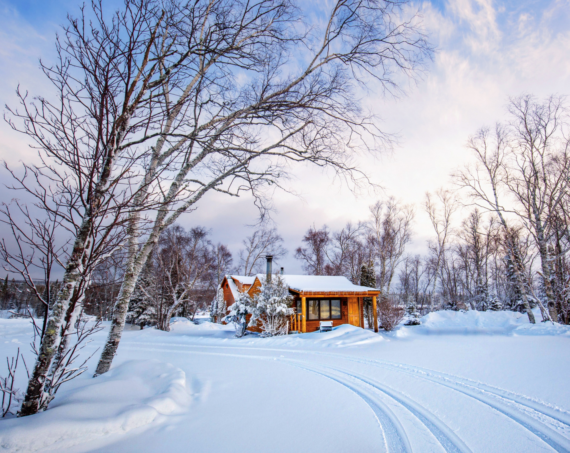
Hi Amy,
first ... I'm not a specialist in landscape photography - but i think, i have a good eye for graphic impact ...
here are my suggestions:
- filter whiteNeutralizer (for white snow)
- adjust the geometry a little bit
- color filter (puffy highlights & puffy shadows)
- sharpen filter
- glow filter
More glow makes the scene more fabulous (and blurrier)
Regards
Ud:o))
PS: I have not seen before that your photo was already published ...
Thanks Ud! I like your edit too. It seems lighter.
